


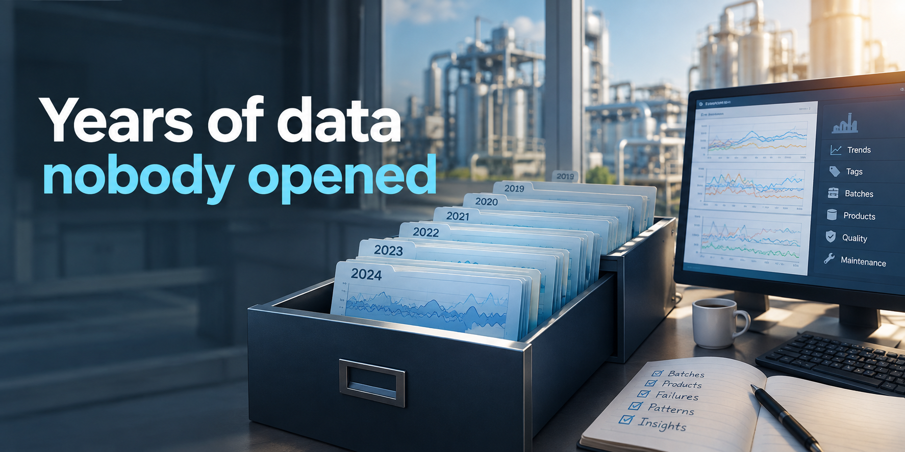
The Years of Data Already Sitting in Your Historian
Almost every plant we talk to has a historian. Wonderware, Ignition, PI, sometimes a mix of all three after a few rounds of upgrades. Many of them have been recording every few seconds for five, ten, even fifteen years.
And in most plants, the way that data gets used looks very similar. Someone opens a trend screen, looks at the last few hours or the last shift, checks that a temperature or pressure is where it should be, and closes it. The history is there for when something goes wrong and someone needs to scroll back to see what happened on Tuesday.
That's a valuable use. But it means years of process behavior, thousands of batches, every good run and every bad one, are stored in a system that's mainly used to look at today.
Why history tends to stay in storage
This isn't a question of effort or attention. It comes down to how historians are built.
A historian is designed to do two things very well: store large amounts of time series data efficiently, and display it as trends. It isn't designed to compare things. It doesn't know what a batch is, which product was running, which step the process was in or whether the result passed quality. To a historian, a cook step, a CIP wash and an idle tank are all just numbers changing over time.
So the moment someone wants to ask a question that goes beyond "what happened at this moment," the work starts. Export the data. Figure out which of the 4,000 cryptically named tags are the relevant ones. Line it up with the production schedule from another system. Separate the batches by hand in a spreadsheet. By the time the data is ready to analyze, the question has often been overtaken by the next urgent issue.
That's why history gets used for looking back at single events and rarely for learning from patterns across hundreds of them.
What's actually in there
When historical data does get organized, it tends to answer four kinds of questions that live data can't.
The first is what normal really looks like. Not the setpoint on the screen or the number in the spec, but how a given product on a given line actually behaves across hundreds of runs: how long each step takes, how much variation is typical, what the good runs have in common. That baseline is what makes it possible to say whether today is unusual.
The second is what happened before things went wrong. Every failure, rejected batch and unplanned stop in the last few years left a record of the hours and days leading up to it. Looking at one event tells you a story. Looking at twenty similar events tells you which signals moved first, and how much warning there was.
The third is slow change. Equipment wear, heat exchanger fouling and sensor drift happen over months. On a live trend they're invisible, because nothing changes noticeably from one shift to the next. Over two years of history, they're often the most obvious pattern in the data.
The fourth is comparison. Line against line, shift against shift, product against product, summer against winter. Many of the most useful findings come from comparisons that are simply impossible to make from a screen showing the last eight hours.
An example: the problem that came back every summer
Here's a case drawn from a few dairy operations. A pasteurizer had occasional flow diversions that nobody could tie to a clear cause. Each one was investigated when it happened, and each time the trends from that day looked a bit different. They were written off as one-off events.
Pulling two years of historian data and lining up every diversion against the production schedule told a different story. The diversions weren't random. They clustered between June and September, and most of them happened in the first hour after a changeover to one particular product.
Looking at the lead-up to each of those events, the hot water loop temperature was hunting more than usual in the minutes before the diversion, and the effect was strongest on warm days. The incoming cooling water was warmer in summer, the product in question needed a slightly different temperature profile, and the control loop that worked fine the rest of the year didn't have enough margin under those combined conditions.
No single day's trend could have shown that. It took two summers of data, sorted by product and season, for the pattern to stand out. The fix was a tuning change and a modified start-up sequence for that product, and the following summer the diversions dropped off.
The real work is adding context
The example above didn't need any new data. Everything was already in the historian. What made it useful was context: knowing which product was running, when changeovers happened, which step the pasteurizer was in and when diversions occurred.
That's usually the step that turns raw history into something you can learn from. Signals get mapped to the equipment they belong to. The PLC's own step and recipe information gets used to split the data into batches and phases. Where it's available, production schedules, maintenance records and quality results get joined in, so a run can be connected to what was made, what was repaired and whether the product passed.
Once that's done, the historian stops being a long list of numbers and becomes a record of every batch the plant has made, with the conditions it was made under and the result.
Start with one question
Trying to organize an entire historian at once rarely works. It's much more effective to start with one recurring problem that people already care about: the CIP circuit that sometimes runs long, the line with unexplained short stops, the product that occasionally comes out of spec.
From there, pull the relevant signals for the last twelve to twenty-four months and check the quality of the data before drawing conclusions. A few practical things are worth knowing. Historian compression and deadband settings can flatten short events, so a pressure spike that lasted three seconds may not be there at all. Tags often get renamed or moved after a control system upgrade, which can make it look like a signal stopped existing. And gaps from network or server outages need to be identified so they aren't mistaken for the process stopping.
None of these are reasons not to use the data. They're simply things to check so the answers are trustworthy.
What history can't tell you
It's worth being clear about the limits, too. If a signal was never recorded, no amount of analysis will bring it back. If it was sampled once a minute, events shorter than that won't be visible. And if a line was rebuilt or a major piece of equipment was replaced, data from before the change may not reflect how the process runs today.
In those cases, history still helps by showing exactly which signals are missing or too coarse. That makes it much easier to decide what to add going forward, rather than instrumenting everything just in case.
Why it's a good place to start
For a lot of plants, historical data is the fastest and lowest-risk way to find out what process monitoring can actually do for them. There's no hardware to install and no connection to the live control network. A data extract from the historian, covering a year or two on one line or system, is enough to build baselines, look at past failures and find slow drifts.
It also shifts the conversation. Instead of asking "what could we learn from our data?" in the abstract, the plant gets specific answers about its own equipment, drawn from its own history. That's usually the clearest way to decide what's worth monitoring live.
The data has been there all along. Most of it just needs to be put in context.
Want to learn more?
Case Studies
How Leading Companies Transform their Operations
Real-world examples of operational excellence achieved through our platform
Drive measurable results. Without operational friction.