Why Your OEE Number Is Lying to You
Why Your OEE Number Is Lying to You
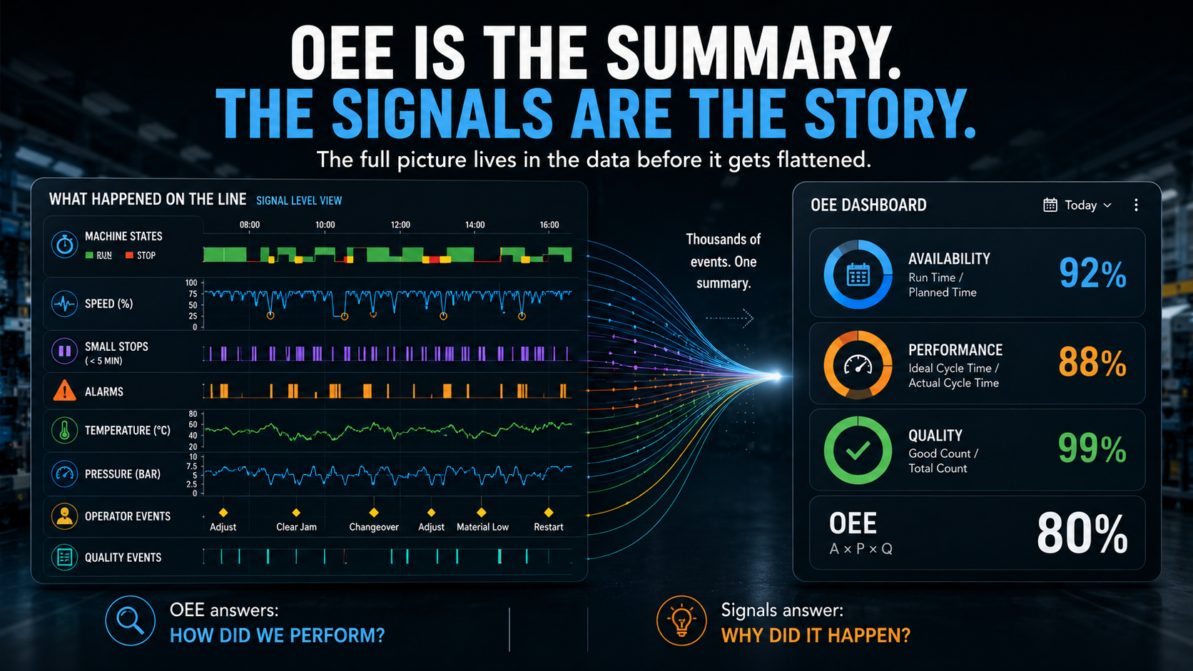
Your machines generate thousands of data points every shift, by the time that data reaches your dashboard, it has been compressed into three numbers, Availability, Performance, Quality, multiplied together into one. That number gets reported, reviewed, and used to make decisions about production.
But somewhere between the machine and the metric, most of the information disappeared.
What data looks like before it gets flattened
A modern production machine does not experience a shift as a smooth average. It experiences it as a continuous stream of events:
Small stops, operator adjustments, temperature fluctuations, pressure drops that recover in seconds, each of these is a signal. Together, they tell a detailed story about how the machine is actually behaving, not how it performed on average, but what it did, in what order, and what came before each problem. That story is not going to the report
What aggregation removes
When raw signal data gets rolled up into OEE, three things happen:
Time collapses. A shift becomes a total. You lose the sequence, which events happened first, what preceded the downtime, whether the speed loss was concentrated in one window or spread across the whole shift, etc... the timeline gets erased.
Variation gets averaged out. A machine that ran at 100% for six hours and 40% for two hours produces the same Performance score as a machine that ran at 85% all day. The average is identical but the operational reality is completely different.
Small events disappear entirely. A two minute stop that recovers on its own barely registers in Availability. A cycle time deviation of a few seconds gets absorbed into Performance without a trace. But these small events are often the early indicators of a larger problem developing. By the time they accumulate enough to move the OEE number, the problem is no longer early stage.
The gap between what happened and what was recorded
This is the part that matters mostour machines were producing information the entire shift. Signals that, if you could see them in sequence and in context, would tell you exactly when something started to change and what it looked like before it became a failure.
The information did not survive the aggregation step.
What reaches your dashboard is a compressed, averaged, decontextualized version of a much richer story.
What changes when you stop flattening
When teams work with signal level data instead of aggregated metrics, the shift in visibility is immediate.
You stop asking "why was OEE down this week" and start seeing the answer before the shift ends. You stop investigating from a summary and start following the actual sequence of events. You stop reacting to the metric and start responding to what the machine was telling you hours sometimes days before the loss became visible in the number.
OEE is a useful summary for reporting, benchmarking, and tracking progress over time, but it is a limited tool for understanding what is actually happening on your floor, by design it was built to summarize. And summarizing means losing exactly the kind of detail that makes early intervention possible.
The data was always there
That is the uncomfortable part of this.
The signals that could have predicted the failure, explained the quality loss, or caught the degradation before it became downtime — they were being generated the whole time.
The question is not whether your machines are producing useful data, the question is how much of it survives long enough to be acted on.
Want to learn more?
Fallstudien
Wie führende Unternehmen ihre Geschäftstätigkeit transformieren
Beispiele aus der Praxis für betriebliche Exzellenz, die durch unsere Plattform erreicht wurde
Erzielen Sie messbare Ergebnisse.
Ohne ein großes IT Projekt.